Coding a Stylish Blog Design Layout in HTML & CSS
Last week we went through the process of designing a stylish blog layout in Photoshop. Now let’s take our visual concept and cut it into slices for use with neat HTML and CSS code. All our browser testing will be done on this coded concept before converting the design into a full WordPress theme.
At the end of the last post, the design concept had been put together in Photoshop and was all ready to rock. To refresh your memory, here’s the design we’ll be working on.
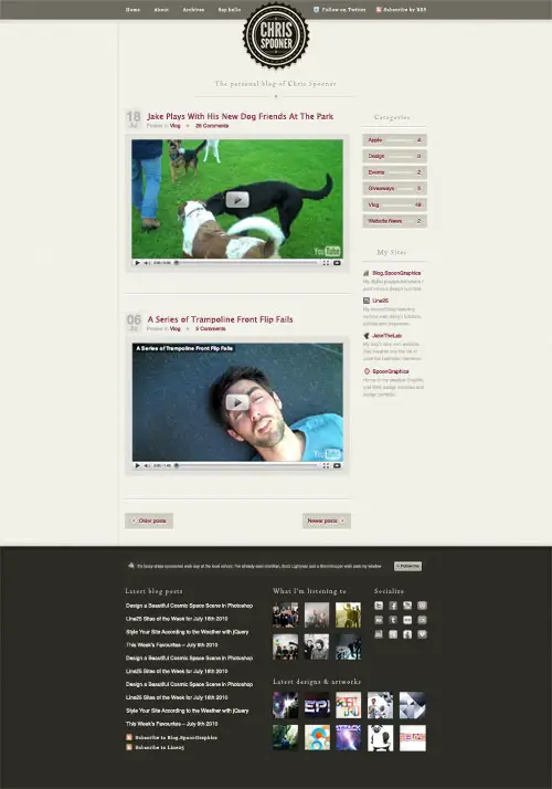
Exporting the images
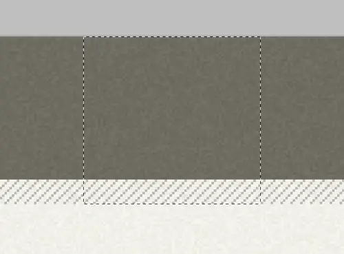
The first step is to go through the whole design and export tiny images. Being a design that makes use of textures and patterns, many of the graphics are clipped down to repeating tiles.
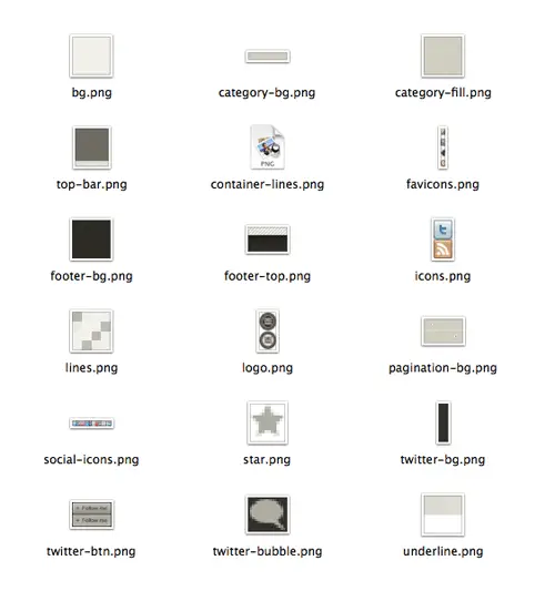
In final collection of files the majority of images are saved with the PNG format due to their minimal colour palette. This bunch of small files will also help drastically with page load times.
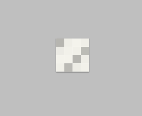
Some images, like the diagonal lines swatch are just 4px in size, making them super small images, but they cover a large portion of the actual design.
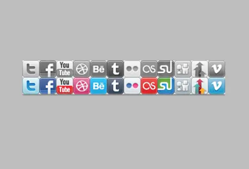
Where there’s lots of instances of a similar graphic, they are combined into a sprite image. Each individual graphic will be picked out using CSS background positioning.
Writing the HTML markup
<!DOCTYPE html>
<html>
<head>
<meta charset="utf-8" />
<title>ChrisSpooner.com</title>

<link href="style.css" rel="stylesheet" type="text/css" media="screen" />

<body>

<div id="container"></div>

</body>
</html>
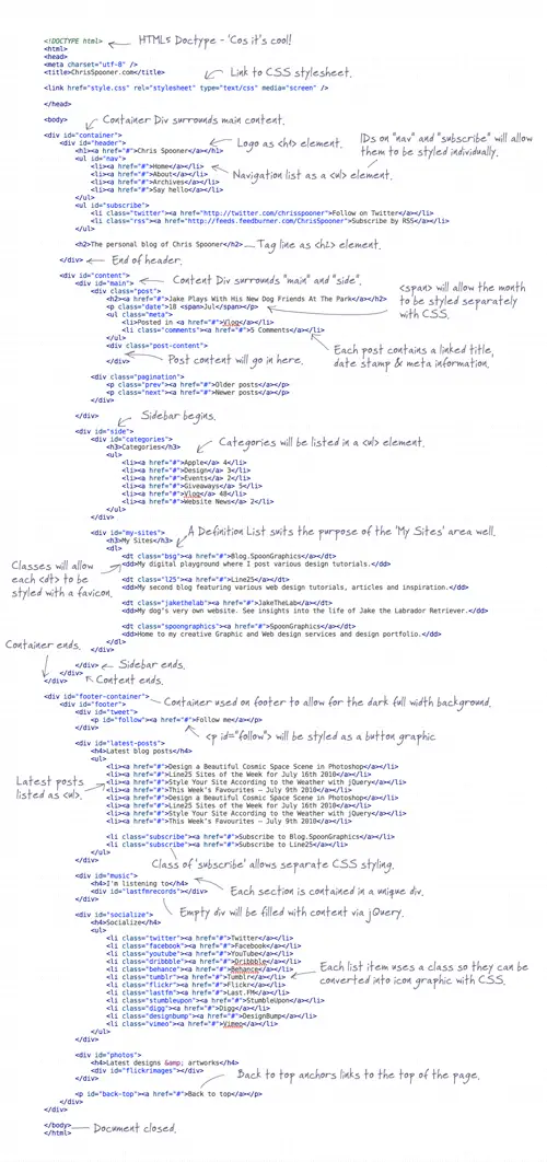
The HTML document is started with a Doctype. Here the new HTML5 Doctype is used simply because it’s cool and does the job in 15 characters. Not all the HTML5 markup tags are supported, but HTML in an XHTML fashion will still validate perfectly fine. Elsewhere the CSS stylesheet is loaded, then the markup begins with a container div to house the following elements.
<div id="header">
	<h1><a href="#">Chris Spooner</a></h1>
	<ul id="nav">
		<li><a href="#">Home</a></li>
		<li><a href="#">About</a></li>
		<li><a href="#">Archives</a></li>
		<li><a href="#">Say hello</a></li>
	</ul>
	<ul id="subscribe">
		<li class="twitter"><a href="#">Follow on Twitter</a></li>
		<li class="rss"><a href="http:#">Subscribe by RSS</a></li>
	</ul>

	<h2>The personal blog of Chris Spooner</h2>

</div>
First up in the markup is the header area, which is neatly contained within a <div> named “header”. Within this is a <h1> element to act as the logo, and <ul> elements to produce the two menus. In the concept the items appear in the following order: Nav – Title – Subscribe, which is fine in visual terms, but doesn’t read correctly as a document so it’s ordered as Title – Nav – Subscribe in the HTML. The elements can be rearranged with CSS positioning later.
<div id="content">
	<div id="main">
		<div class="post">
			<h2><a href="#">Jake Plays With His New Dog Friends At The Park</a></h2>
			<p class="date">18 <span>Jul</span></p>
			<ul class="meta">
				<li>Posted in <a href="#">Vlog</a></li>
				<li class="comments"><a href="#">5 Comments</a></li>
			</ul>
			<div class="post-content">

			</div>
		</div>

		[...]

		<div class="pagination">
			<p class="prev"><a href="#">Older posts</a></p>
			<p class="next"><a href="#">Newer posts</a></p>
		</div>

	</div>
A div with an ID of “content” contains the divs “main” and “side” which will act as the main content and sidebar columns. Inside the main content, each post is enclosed within a “post” div. Every post is made up of title, date stamp, meta information and of course the post content.
		<div id="side">
			<div id="categories">
				<h3>Categories</h3>
				<ul>
					<li><a href="#">Apple</a> 4</li>
					<li><a href="#">Design</a> 3</li>
					<li><a href="#">Events</a> 2</li>
					<li><a href="#">Giveaways</a> 5</li>
					<li><a href="#">Vlog</a> 48</li>
					<li><a href="#">Website News</a> 2</li>
				</ul>
			</div>

			<div id="my-sites">
				<h3>My Sites</h3>
				<dl>
					<dt class="bsg"><a href="#">Blog.SpoonGraphics</a></dt>
					<dd>My digital playground where I post various design tutorials.</dd>

					<dt class="l25"><a href="#">Line25</a></dt>
					<dd>My second blog featuring various web design tutorials, articles and inspiration.</dd>

					<dt class="jakethelab"><a href="#">JakeTheLab</a></dt>
					<dd>My dog’s very own website. See insights into the life of Jake the Labrador Retriever.</dd>

					<dt class="spoongraphics"><a href="#">SpoonGraphics</a></dt>
					<dd>Home to my creative Graphic and Web design services and design portfolio.</dd>
				</dl>
			</div>

		</div>
	</div>
</div>
The sidebar is made up of a category list titled with a <h3> and created using a <ul> element. Underneath this is the “My Sites” list, which will be hard coded into the site as a Definition List. The relationship between the site title and description make it perfectly suited as a <dl>.
<div id="footer-container"> <div id="footer"> <div id="tweet"> <p id="follow"><a href="#">Follow me</a></p> </div> <div id="latest-posts"> <h4>Latest blog posts</h4> <ul> <li><a href="#">Design a Beautiful Cosmic Space Scene in Photoshop</a></li> <li><a href="#">Line25 Sites of the Week for July 16th 2010</a></li> <li><a href="#">Style Your Site According to the Weather with jQuery</a></li> <li><a href="#">This Week’s Favourites – July 9th 2010</a></li> <li><a href="#">Design a Beautiful Cosmic Space Scene in Photoshop</a></li> <li><a href="#">Line25 Sites of the Week for July 16th 2010</a></li> <li><a href="#">Style Your Site According to the Weather with jQuery</a></li> <li><a href="#">This Week’s Favourites – July 9th 2010</a></li> <li class="subscribe"><a href="#">Subscribe to Blog.SpoonGraphics</a></li> <li class="subscribe"><a href="#">Subscribe to Line25</a></li> </ul> </div> <div id="music"> <h4>I'm listening to</h4> <div id="lastfmrecords"></div> </div> <div id="socialize"> <h4>Socialize</h4> <ul> <li class="twitter"><a href="#">Twitter</a></li> <li class="facebook"><a href="#">Facebook</a></li> <li class="youtube"><a href="#">YouTube</a></li> <li class="dribbble"><a href="#">Dribbble</a></li> <li class="behance"><a href="#">Behance</a></li> <li class="tumblr"><a href="#">Tumblr</a></li> <li class="flickr"><a href="#">Flickr</a></li> <li class="lastfm"><a href="#">Last.FM</a></li> <li class="stumbleupon"><a href="#">StumbleUpon</a></li> <li class="digg"><a href="#">Digg</a></li> <li class="designbump"><a href="#">DesignBump</a></li> <li class="vimeo"><a href="#">Vimeo</a></li> </ul> </div> <div id="photos"> <h4>Latest designs & artworks</h4> <div id="flickrimages"></div> </div> <p id="back-top"><a href="#">Back to top</a></p> </div> </div>
The markup is finished off with the footer. Because the design uses a contrasting footer colour, an extra container is used to surround the footer elements, then the actual footer div is centred up inside the container. Each section of the footer is laid out inside its own div to group the elements together and make it easier to lay out the design later. Some sections like the Last.FM and Flickr streams are created using Javascript plugins, which require empty divs in which the content is placed. If the site needed to be super accessible, HTML messages for non-Javascript users would be placed inside these elements, then hidden by Javascript so they don’t appear for Javascript-enabled users.
Styling with CSS
body, div, h1, h2, h3, h4, h5, h6, p, ul, ol, li, dl, dt, dd, img, form, fieldset, blockquote {
	margin: 0; padding: 0; border: 0;
}

body {
	background: #f6f5ee url(images/bg.png);
	font: 14px/22px Helvetica, Sans-Serif;
}

@font-face {
	font-family:'Tallys';
	src: url('images/Tallys.otf') format('opentype');
}


#container {
	background: url(images/top-bar.png) top repeat-x;
	background: url(images/top-bar.png) top repeat-x, url(images/footer-top.png) bottom repeat-x;
	padding: 0 0 31px 0;
}
The CSS document begins with a quick reset to remove any browser default styling, then gets to business setting the background colour and texture on the body, as well as setting a global font style. Underneath this, the CSS3 @font-face rule is set up to load the font Tallys, which is used on certain headers within the design.
The #container is given the repeating graphic that generates the top bar, as well as a second background for browsers supporting CSS3 multiple backgrounds. Those supporting browsers will also see the strip of diagonal lines that appear just above the footer, but being just a visual touch it won’t be missed by the more unfortunate viewers on older browsers.
#header {
	width: 961px; margin: 0 auto; position: relative;
	overflow: hidden;
}
	#header h1 a {
		position: absolute; top: 5px; left: 376px;display: block; width: 208px; height: 213px;
		background: url(images/logo.png); text-indent: -9999px;
	}
		#header h1 a:hover {
			background-position: bottom;
		}

	#header ul#nav {
		float: left; margin: 22px 0 0 24px; list-style: none;
	}
		#header ul#nav li {
			float: left; margin: 0 0 0 45px;
		}
			#header ul#nav li:first-child {
				margin: 0;
			}
				#header ul#nav li a {
					display: block; font: 13px Georgia, Serif; letter-spacing: 2px; color: #eeede6;
					text-decoration: none;
				}
					#header ul#nav li a:hover {
						color: #d0cfc8;
					}

	#header ul#subscribe {
		float: right; margin: 22px 24px 0 0; list-style: none;
	}
		#header ul#subscribe li {
			float: left; margin: 0 0 0 32px;
		}
			#header ul#subscribe li a {
				display: block; height: 16px; font: 13px Georgia, Serif; letter-spacing: 2px; color: #eeede6;
				text-decoration: none; padding: 1px 0 0 27px;
				background: url(images/icons.png) left 1px no-repeat;
			}
				#header ul#subscribe li.rss a {
					background-position: left -16px;
				}
					#header ul#subscribe li a:hover {
						color: #d0cfc8;
					}

	#header h2 {
		margin: 250px 0 0 0; min-width: 500px; clear: both; text-align: center;
		background: url(images/top-divider.png) center bottom no-repeat; padding: 0 0 30px 0;
		font: 24px Tallys, Georgia, Serif; letter-spacing: 4px; color: #afada2;
		text-shadow: 0px 1px 0px #fff;
	}
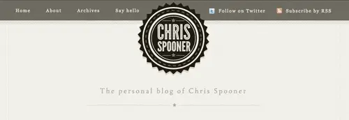
The #header is then centred up on the page and is given position:relative to allow for absolute positioning of the logo inside the confines of the header div. The logo itself is generated from the h1 using a specific width and height for the logo background image. The logo graphic contains both the normal and hover variations of the logo, so the position of the sprite is changed on :hover.
The two navigation elements are floated to the left and right sides of the logo, then the default list styling is removed and each li floated to display horizontally. Text styling is set up as 13px Georgia with letter-spacing giving the type a cool visual touch. On the anchors inside the ul#subscribe, icons are added as background images to produce the RSS and Twitter graphics.
The tagline on the design concept sits centrally underneath the logo, so a mixture of margin, text-align and clear:both help move the h2 into place. The font styling on the concept uses the custom Tallys font, so this is added using the @font-face rule recently setup. The inset effect is created using more CSS3 magic, this time in the form of a simple 1px white text-shadow.
#content {
	width: 917px; margin: -240px auto 0 auto; padding: 280px 22px 0 22px;
	background: url(images/container-lines.png) repeat-y;
}

	#content #main {
		width: 684px; float: left;
	}
		#content #main .post {
			position: relative; margin: 0 0 60px 0; padding: 0 0 66px 0; overflow: hidden;
			background: url(images/underline.png) bottom repeat-x;
		}
			#content #main .post h2 {
				float: left; margin: 0 0 10px 75px;
				font: 24px Lucida Grande, Lucida Sans Unicode, Helvetica, Sans-Serif; letter-spacing: normal;
			}
			#content #main .post p.date {
				position: absolute; left: 0; top: 0; padding: 4px 7px 4px 7px;
				background: url(images/lines.png);
				font: bold 40px Helvetica, Sans-Serif; color: #b6b6b1; text-align: center;
			}
				#content #main .post p.date span {
					font: normal 20px Helvetica, Sans-Serif;
					display: block; margin: -5px 0 0 0;
				}
			#content #main .post ul.meta {
				float: left; list-style: none; margin: 0 0 30px 75px; overflow: hidden;
				font: 16px Helvetica, Sans-Serif; color: #b6b6b1;
			}
				#content #main .post ul.meta li {
					float: left; margin: 0 20px 0 0;
				}
					#content #main .post ul.meta li.comments {
						padding: 0 0 0 32px; background: url(images/star.png) left center no-repeat;
					}
			#content #main .post .post-content {
				clear: both;
			}


			#content #main .pagination {
				margin: 0 0 60px 0; overflow: hidden;
			}
				#content #main .pagination p {
					margin: 0;
				}

			#content #main .pagination p a {
				display: block; width: 102px; height: 33px; overflow: hidden;
				background: url(images/pagination-bg.png); font-size: 16px;
			}
				#content #main .pagination p.prev a {
					float: left; padding: 14px 0 0 46px;
				}
				#content #main .pagination p.next a {
					float: right; text-align: right; padding: 14px 46px 0 0;
					background-position: 0 -47px;
				}
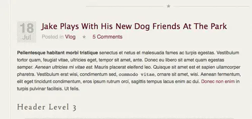
The #content div is moved into place using margin: -240px auto 0 auto. The -240px margin on the top helps pull the content back up where it had previously been dropped down by the logo graphic. Each .post div is given margin and padding to space out each blog entry, and a background image provides a neat underline between each one. All the elements inside the post are then styled up with the appropriate font styling to match the concept. The date stamp p.date is given a large font-size to accommodate the date numbers, then the span is reset with a smaller font size and given the display:block; rule to drop it down underneath.
After all the post content styling the .pagination buttons are transformed from plain paragraph elements into large button graphics. They’re first floated left and right, they’re given specific widths and heights according to the actual image file. padding is added to the anchor to position it centrally inside the button.
	#content #side {
		width: 196px; float: left; margin: 0 0 0 37px;
	}

		#content #side h3 {
			font: 22px Tallys, Georgia, Serif; letter-spacing: 4px; color: #afada2; text-align: center; text-shadow: 0px 1px 0px #fff;
			background: url(images/underline.png) bottom repeat-x; padding: 0 0 15px 0; margin: 0 0 20px 0;
		}

		#content #side #categories {
			margin: 0 0 66px 0;
		}
			#content #side #categories ul {
				list-style: none;
			}
				#content #side #categories ul li {
					position: relative; width: 156px; height: 29px; padding: 11px 20px 0 20px; margin: 0 0 10px 0;
					background: url(images/category-bg.png); font-size: 16px; text-align: right;
					color: #afada2; text-shadow: 0px 1px 0px #fff;
				}
				#content #side #categories ul li a {
					float: left; background: url(images/category-fill.png); padding: 0 10px 0 0;
				}


		#content #side #my-sites {
			margin: 0 0 66px 0;
		}
			#content #side #my-sites dl dt {
				font-size: 16px; padding: 0 0 0 26px;
				background: url(images/favicons.png) no-repeat;
			}
				#content #side #my-sites dl dt.bsg {
					background-position: 0 1px;
				}
				#content #side #my-sites dl dt.l25 {
					background-position: 0 -24px;
				}
				#content #side #my-sites dl dt.jakethelab {
					background-position: 0 -51px;
				}
				#content #side #my-sites dl dt.spoongraphics {
					background-position: 0 -76px;
				}

				#content #side #my-sites dl dd {
					font-size: 14px; color: #bcbbb5; margin: 0 0 10px 0;
				}
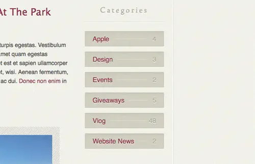
The sidebar is floated alongside the main content div and given a spot of left margin to space out the columns. All the h3 elements in the sidebar use the Tally font styling with inset text effect. An underline background image provides a divider between the titles and content. The #categories ul li elements are given similar styling to the pagination buttons, where a specific width and height is used to display a background graphic. To recreate the line between the category and post count, a line was added to the background image, then a plain textured fill added to the anchors to hide the line where it runs underneath the text.
The styling for the definition list is quite simple, other than some CSS to set the font styling, just the favicon images had to be set with different background positioning on each dt element.
#footer-container {
	background: #2f2f28 url(images/footer-bg.png);
}

#footer {
	width: 917px; margin: 0 auto; padding: 20px 22px 66px 22px; overflow: hidden;

}
	#footer a {
		color: #eeede6; text-decoration: none;
	}
		#footer a:hover {
			color: #d0cfc8;
		}
	#footer h4 {
		font: 22px Tallys, Georgia, Serif; letter-spacing: 4px; color: #afada2; margin: 0 0 14px 0;
	}

	#footer #tweet {
		width: 897px; height: 39px; margin: 0 auto 38px auto; padding: 19px 10px 0 10px;
		background: url(images/twitter-bg.png) repeat-x;
	}
		#footer #tweet p#message {
			float: left; color: #afada2; padding: 0 0 0 25px; font-size: 12px;
			background: url(images/twitter-bubble.png) left 2px no-repeat;
		}
		#footer #tweet p#follow a {
			float: right; display: block; width: 85px; height: 27px; margin: -3px 0 0 20px;
			background: url(images/twitter-btn.png); text-indent: -9999px;
		}
			#footer #tweet p#follow a:hover {
				background-position: bottom;
			}


	#footer #latest-posts {
		width: 430px; float: left;
	}
		#footer #latest-posts ul {
			list-style: none;
		}
			#footer #latest-posts ul li {
				font-size: 16px; margin: 0 0 27px 0;
			}

			#footer #latest-posts ul li.subscribe {
				margin: 0 0 10px 0;
			}
				#footer #latest-posts ul li.subscribe a {
					display: block; height: 17px;
					font: 13px Georgia, Serif; letter-spacing: 2px; color: #eeede6;
					padding: 0 0 0 27px; background: url(images/icons.png) left -16px no-repeat;
				}
					#footer #latest-posts ul li.subscribe a:hover {
						color: #d0cfc8;
					}
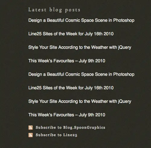
The design ends with a large footer which contains all kinds of information. Being of full width and having the dark background fill it required both the #footer-container, and the child #footer divs to allow the concept to be replicated. Slightly different font styling was needed inside the footer, particularly link colours, so the #footer a and #footer h4 were altered from those used in the upper portion of the design. At the top of the footer is a latest tweet box. This is styled up as a div named #tweet, while the tweet message and follow button are restyled paragraph elements.
In the #latest-posts ul the list is spaced out with some bottom margin and set at a font-size of 16px. The two li items with the class of .subscribe are given slightly different styling using a serif font and an RSS icon as a background image.
Adding Javascript functionality
With the main website now all coded up, all that’s left is to populate those footer sections with content from the various social sites. The Twitter div should display my latest tweet, the music div should display a list of my popular music tracks from Last.FM and the photos div should display recent pictures from Flickr.
$.getJSON("https://twitter.com/statuses/user_timeline.json?screen_name=chrisspooner&count=1&callback=?",
		function(data){
			$.each(data, function(i,item){
			ct = item.text;
			ct = ct.replace(/http:\/\/\S+/g,  '<a href="$&">$&</a>');
			ct = ct.replace(/\s(@)(\w+)/g,    ' @<a href="https://twitter.com/$2">$2</a>');
	 		ct = ct.replace(/\s(#)(\w+)/g,    ' #<a href="http://search.twitter.com/search?q=%23$2">$2</a>');
	   		$("#tweet").append('<p id="message">'+ct +'</p');
	  	});
	 });

    jQuery(document).ready( function() {
       var _config = {
         username: 'spoongraphics',
         count: 6,
         period: '7day'
     };
    lastFmRecords.init(_config);
    });

	$('#flickrimages').flickrush({id:'10201900@N03' });
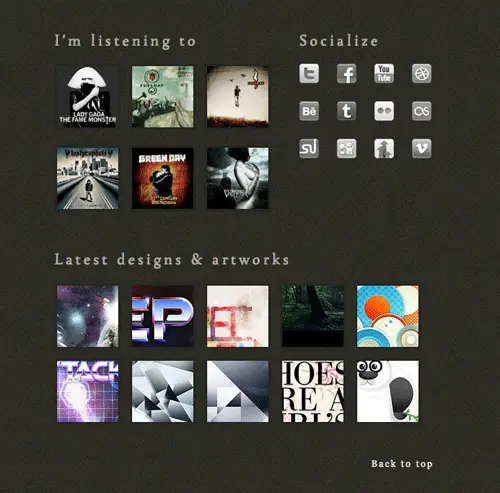
Three jQuery resources were used to create the functionality. Firstly, the Twitter message is called using JSON as described in this handy tutorial from Ninanet. The Last.FM top tracks list is generated using this fantastic plugin from Jeroen Smeets, which can either be used as a WordPress plugin, or directly through jQuery. Finally, the Flickr stream is producing using a slightly modified version of the Flickrush plugin from Philip Beel.



Comments
Post a Comment